The Journey from Hackathon to Production: Lessons Learned
| published by | Krishnanunni Radhakrishna |
|---|---|
| in blog | Instawork Engineering |
| original entry | The Journey from Hackathon to Production: Lessons Learned |
The Journey from Hack-a-thon to Production: Lessons Learned

At Instawork, hackathons are a time-honored tradition. Every few quarters, our teams eagerly anticipate the chance to collaborate on experimental ideas, explore new technologies, and have a blast doing it. Over the years, many hackathon projects have become integral parts of our product, such as NFC-based clock in/out features, crowdsourcing staffing information, and our innovative Falcon tool.
This was my first hackathon at Instawork and the theme for this year was “Scale to 10x.” At Instawork we spend a whole week for our hackathon, the entire engineering team stops working on their sprints and directs all their focus and attention to their ambitious ideas.
I had the pleasure of taking an idea from a hackathon to production and creating an impact for millions of Pros on our platform. This is a quick read on my journey through that process.
Ideation Time
At Instawork — everyone is involved in hackathons not just engineers, Design, Product, and Operations teams all contribute to the idea pool, bringing real-world problems they’re passionate about solving.
Instawork has been successful in creating enormous economic opportunities for our Pros. An aspect that has intrigued me was the insights into Pro behaviours, hence the idea for “Instawork Year in Review”. I would be lying if I said I wasn’t inspired a bit by Spotify’s Year in Review, they have successfully gamified one of their metrics to ensure share-ability. This is something people talk about and clearly shows how indispensable the app is to a lot of people.
We were drawn to this idea by its technical difficulty and the impact it would have on the Pros of our platform. We sought to push our limits and produce something beneficial for our users. And that was a good enough reason for us to build it.
Hackathon Week!
Getting Started
We got an all-star team setup with a product manager, product analyst, user research, designers, engineers and QA, each of us Acting Like an Owner, we asked ourselves the following questions:
- What data would our users care the most about? What would make them proud?
- What’s the coolest way of showcasing this information?
- What tech do we need to build this?
- How can we drive engagement?
Each of these questions may appear to be tied to a certain role (product management, UX etc) but at Instawork everyone is encouraged to be candid and share their opinions on the best way to do something.
What data would our users care the most about? What would make them feel proud?
After much discussion and input from our User Research team, we narrowed down the most important metrics to share with our Pros:
- Number of Shifts Worked
- Earnings
- Extra Earnings being a Top Pro
- Reliability
- Ratings & Appreciation from our Partners
What tech do we need to build this?
Calculating all the data in real-time would not have been feasible, considering that much of this data is spread across several large tables, requiring complex joins and aggregates.
We found a simple and fast solution: Rahul, our analytics expert, pre-calculated all the data in our Redshift warehouse, we then moved this data to our production MySQL cluster and quickly built up APIs in Django to serve this data.
With the data in place, we focused on the user experience (UX).
Now on to the UX
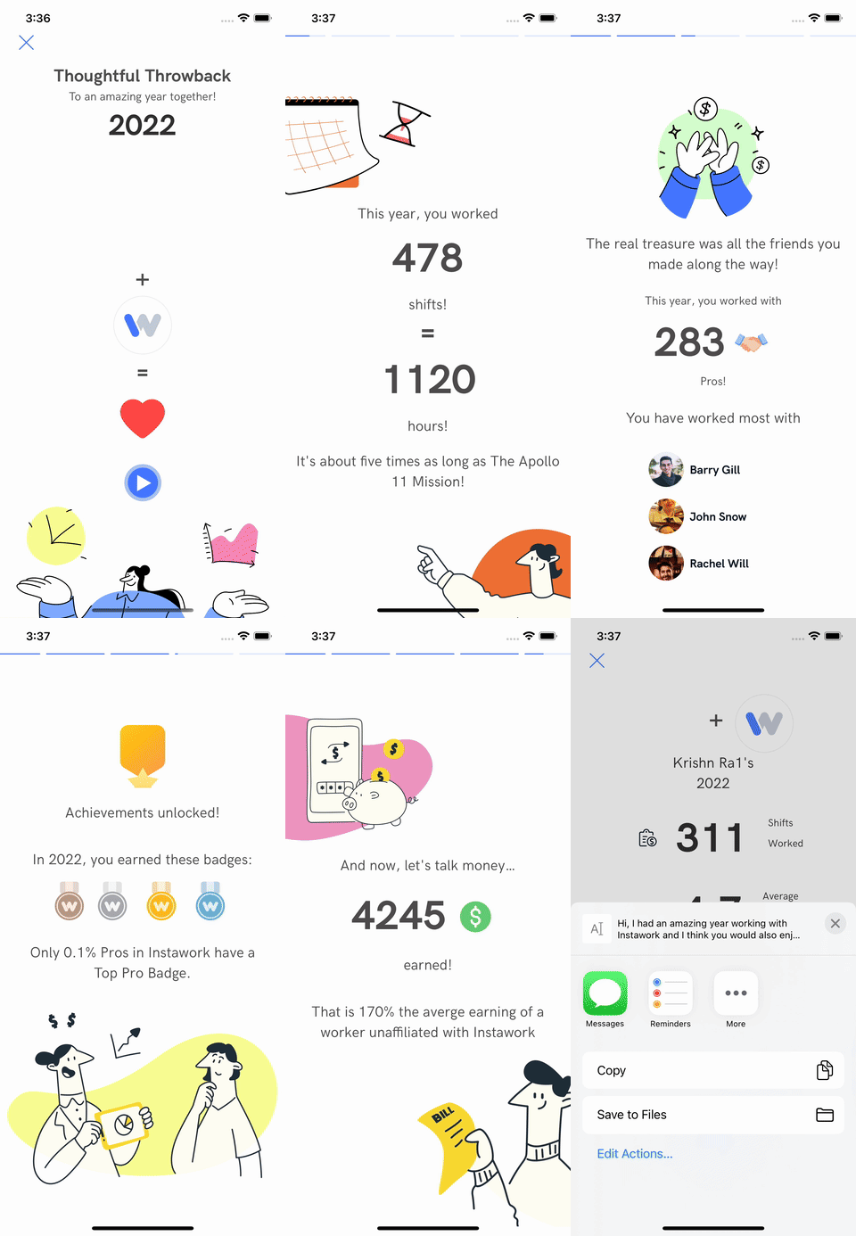
After iterating over what we want to build — we finally decided on building something similar to “stories” available in many other apps — we want to share a stats slideshow with a progress bar at the top keeping track of the progress for each slide.
Our mobile app is built using the react native tech stack, but we mostly program in our own server-side rendering framework over react native — Hyperview allowing us to ship code quickly. So it was decided, we will build using Hyperview, now what do we want to do with Hyperview?
We quickly ran into two roadblocks, displaying the progress bar and enabling navigation via taps.
For the progress bar problem, we had a solution — we would use the Lottie library to show the animation, it was already integrated with Hyperview making it very easy to build this feature out.
For each of the stat screens, we would add a corresponding Lottie animation. When a user navigates from one screen to the next or the animation reaches its end, we create an event to hide the current screen and show the next screen.

And as for the tap-to-navigate behaviour — after experimenting with Hyperview for a bit we were able to overlay empty views at the edges of each screen, for which we could define an on-click behaviour to hide the current screen or show the next screen.
How do we handle engagement?
Pros have done a lot of considerable and note-worthy work in the last year, many of them would be proud of what they have done and would love to share this stat with others. So when the user clicks the share button on a stat page, we would request the server, which would overlay the user’s number on the image template and return it, and then we’d insert this into the code and trigger a system share dialogue.
Our main pain points were solved and we had creatively named this project ‘Thoughtful Throwback’ ready for the show.
We were one of the winners and our project got the green light to go into production and be a full-fledged feature.

Go to Production!
For going to production, we had to start from scratch with our thinking since a lot of our “hacks” wouldn’t work in production and at a user level without a degraded experience.
Unlike the hackathon, where we focused on the technical aspects of our project, this time we had to think creatively and strategically about what we wanted to create.
What do we show to the users?
Figuring out what to show to the users was an interesting exercise — after rounds and rounds of iteration, we had an idea of what data we should be showing to the users and how we should be conveying it.
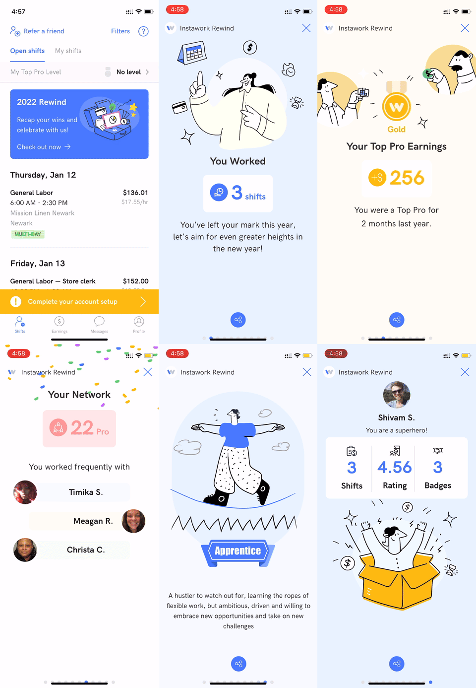
The number of stats ballooned from 5 during the hackathon to almost 12 in our final iteration. Making designs for these 12 stats was again an iterative process where we reworked and reworked what we wanted to convey to the Pro and how we wanted to convey it.
Once the designs were nearly done, it was time for the implementation.
The first question was what do we keep from the hackathon and what do we scrap?
And dabbling with implementation for the designs it was very clear — we had to scrap a lot of the things and we would have to start from scratch. The whole mechanism with Lottie animation for the progress bar was much more noticeable when had 12 stats, furthermore, the new designs deviated so much from the hackathon designs, it was easier to just build from scratch.
Redoing the designs
The designs for most stats were pretty straightforward — but some of them were a little bit more complex than others. One of the more exciting stats to build was the “badges earned” stat. In order to visually represent the badges a Pro has earned so far and the badges they could earn, we showed a grid where the earned badges are highlighted and the badges to be earned are greyed out. There are a few more stats that require a specialized effort.
Even though the logic for sharing from the hackathon was a bit hacky, we went ahead with it. Share functionality was a non-negotiable for all of us, as we all felt this feature wouldn’t add as much value to the Pros if it couldn’t be easily shared.
Getting the data
In parallel, while working on the designs we had the analytics team working on providing data for the stats we needed, and we made the decision to cut down the dataset based on metrics to ensure that the feature is only shown to Pros with a minimum threshold of data. Our approach to getting this data remained the same, we would export the data from the warehouse and import it as CSV, the CSV had become too big to import in one go, so we had to break down the CSV into chunks or import this data via S3. As I wrote a Python script to break down the CSV into multiple CSVs and we started importing the data, I quickly learned one of my mistakes — no data is going to be clean.
There was a lot of pollution in the data — there were nulls and empty spaces where there shouldn’t be. Thankfully python worked well with CSVs, so the process of breaking down CSVs turned into a process of cleaning the data and breaking down the CSVs. We tweaked the script enough to a point where the output of the data was clean enough.
Roll-out
We wanted to do a phased rollout where the Users with the best stats would have it shown first. We had to figure out a way to find the “strength” of the data. In order to do this we decided on a framework — for some stats just being present vs not present was good enough for us, while for other stats we had a breakdown based on the value of the stat, where we may assign it as being — bad, average or good. We accumulated the data to calculate the overall score. We made use of a dynamic variable to act as a threshold for showing this feature to different users.
And the feature was out!

Learnings
The impact we were able to make with this feature was great — my biggest takeaway from building this whole feature was being able to better empathize with our Pros and seeing how it impacted their lives. Being involved in all facets of the project helped me gain a new perspective and appreciation for all that goes on behind the scenes at different teams to nurture a feature from an idea to something impactful.
Have you ever taken a project from Hack-a-thon into production? Tell us your stories!
The Journey from Hackathon to Production: Lessons Learned was originally published in Instawork Engineering on Medium, where people are continuing the conversation by highlighting and responding to this story.